
WeDevelop Case Study
Building Bonelo: a new digital platform for everyday generosity
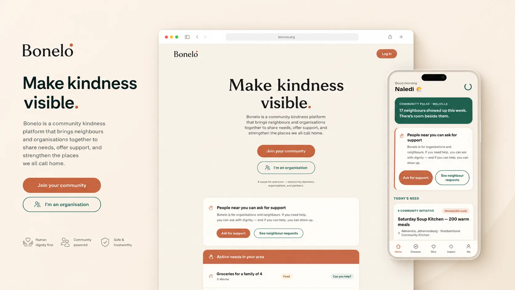
WeDevelop created the brand, digital strategy, website and early product direction for Bonelo—a South African platform designed to make everyday generosity visible.
Project snapshot
- Client
- Bonelo
- Category
- Social technology and community platform
- Primary market
- South Africa
- Project stage
- Founding-community launch
- Services
- Strategy, naming, brand identity, user experience, website design, development and early product prototyping.
The challenge
Kindness already happens. The problem is that it remains fragmented and largely invisible.
People ask for help, offer assistance and support their communities every day. Most of those interactions happen across fragmented WhatsApp groups, social feeds, neighbourhood forums and private conversations.
These tools make communication possible, but they were not designed to organise generosity, establish trust or recognise the people who contribute to their communities.
Bonelo needed to create a distinct digital experience: human rather than transactional, hopeful rather than performative, and useful to individuals without excluding organisations.
- Make asking for help feel dignified and safe.
- Make offering help simple and visible.
- Create a platform centred on contribution rather than popularity.
- Balance individual participation with organisational involvement.
- Build trust without turning generosity into a competition.
The strategic idea
Human kindness already exists. Bonelo makes it visible.
The central opportunity was not to invent a new human behaviour. It was to create a better environment for a behaviour that already exists.
Bonelo brings asking, offering, thanking and recognising contribution into one coherent experience. The platform is designed around real human needs and practical community participation rather than follower counts, outrage or passive engagement.
Ask
People can share genuine needs and request practical support from their community.
Offer
Members can offer time, knowledge, resources or assistance.
Recognise
Helpful actions can be acknowledged, making positive contribution more visible.
Belong
Trust and community grow through participation, not popularity.
Naming and identity
A brand built around recognition, dignity and belonging
The Bonelo identity was developed to feel warm, contemporary and distinctly human.
The name is connected to themes of being seen, belonging and recognising one another. It supports the platform’s wider belief that generosity becomes more powerful when people and their contributions are acknowledged.
Bonelo needed a name and symbol that could express more than generosity alone. The identity had to speak to recognition, dignity, participation and the feeling of belonging to something larger than yourself. The name and the B symbol were therefore developed as one connected idea: people matter, contribution matters, and positive action becomes more powerful when it is seen.
Naming the platform
Where the name Bonelo came from
Bonelo is a created brand name, not the direct translation of a single existing word.
It emerged from the emotional territory surrounding two important African ideas: Sawubona—the act of truly seeing and acknowledging another person—and Ubuntu—the understanding that our humanity is shaped through our relationships with one another.
The name needed to feel warm, memorable and African in spirit without becoming literal, institutional or confined to a traditional charity model. It also needed enough range to grow with the platform—from local requests and offers of help to a wider digital community built around trust, contribution and belonging.
Bonelo was selected because it could hold the central ideas behind the product: being seen, recognising one another, belonging, dignity and the good that moves between people.
A name for a platform where people, needs and acts of generosity are seen.
Designing the symbol
Turning the idea of being seen into a B

Once the name had been selected, the identity needed a symbol that could carry the same meaning without relying on a predictable heart, handshake or helping-hand icon.
The result is the Seen B: a custom, high-waist letter B drawn as filled contours, developed as part of the logo development and visual identity work to perform two roles — the opening letter of the Bonelo wordmark and a recognisable standalone symbol for the platform.
Its construction balances strength with warmth. The vertical stem is strong without being heavy, giving the mark stability and confidence, while the rounded bowls prevent it from feeling rigid, corporate or mechanical. The high waist creates a distinctive silhouette and allows the upper and lower bowls of the symbol to perform different emotional roles.
Sitting high and to the left in the upper bowl is the small offset presence dot — the emotional focal point of the identity. It can be read as a person, a point of attention or a moment of recognition: the quiet Sawubona sense of “I see you”, expressed without drawing a literal eye.
It represents presence: someone is here, someone matters and someone has been acknowledged.
Anatomy of the mark
Every part of the B has a role
- Strong, grounded stem
- The vertical stem is strong without being heavy. It gives the symbol structure, confidence and stability, and allows the more expressive rounded bowls to sit within a clear and dependable frame.
- High waist
- The elevated meeting point between the two bowls gives the B its distinctive character. It prevents the symbol from feeling generic and creates a stronger visual relationship between the presence dot, upper bowl and lower bowl.
- Breathing upper bowl
- The upper bowl is lighter and more open. It creates visual air around the presence dot and supports the ideas of awareness, visibility and invitation. The dot should feel held, but not enclosed.
- Offset presence dot
- The small, calm dot introduces a human point of focus within the B. It can suggest a person, a point of attention or a moment of recognition — a positive action becoming visible. It sits deliberately high and to the left of the upper bowl: offset so it reads as presence rather than a centred, literal eye, and so the mark never feels mechanically symmetrical.
- Generous, grounded lower bowl
- The lower bowl is deliberately larger, rounder and more firmly anchored. It brings weight, care and stability to the symbol — generosity that is solid and dependable, not fragile. Where the upper bowl creates openness and attention, the lower bowl creates support and belonging.
- Balanced asymmetry
- The B is intentionally balanced without being perfectly mechanical. This gives it a more human presence and allows the symbol to feel warm, active and distinctive.
- Dual role
- The same locked geometry works as both the opening letter of the Bonelo wordmark and a standalone symbol — the app icon, social-media mark and compact product-interface symbol. The two are never redrawn independently of one another.
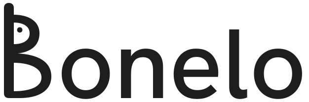
One connected identity
A name and mark built around recognition
The name Bonelo created the verbal space for the brand: warm, ownable and shaped by the ideas of being seen and belonging.
The B turned those ideas into a visual system. Its presence dot creates a point of recognition, the breathing upper bowl allows that presence to breathe, and the generous, grounded lower bowl gives it support.
Together, the name and symbol express the platform’s central belief: generosity already exists between people, but recognition gives it visibility, meaning and momentum.
The Bonelo B is more than an initial. It is a small symbol of presence—a reminder that someone is here, someone matters and someone has been seen.
Brand character
How the brand should feel
- Warm, but not sentimental
- Hopeful, but not naïve
- Modern, but not clinical
- Community-led, but not institutional
- South African in spirit, without relying on clichés
Bonelo colour palette and typography
- Ubuntu Clay
#C96F4A - Deep Belonging Green
#1F5C4D - Warm Sand
#F7F1E8 - Charcoal
#1E1E1E - Soft Gold
#E6B85C - Soft White
#FFFDF8
Sora for expressive headings
Inter for clear, accessible body copy
Where generosity belongs.
Product thinking
Designing the journey around real participation
The product experience was structured around a small number of understandable actions. Each action needed to feel useful on its own while also contributing to a broader community experience.
Discover
See needs, offers and acts of generosity that are relevant to the community.
Ask
Share a personal or community need clearly and respectfully.
Offer
Respond with time, skills, information, goods or practical support.
Connect
Move from a public post into a safer, more direct interaction.
Thank
Recognise the person or organisation that helped.
Build trust
Develop a reputation through consistent, constructive participation.
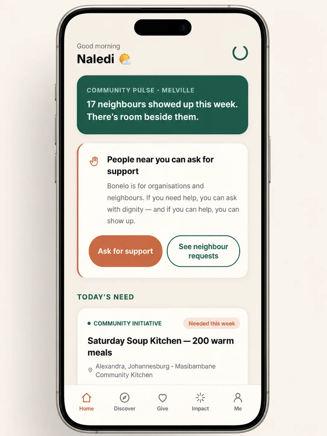
Website experience
Turning an ambitious platform vision into a clear first step
The initial Bonelo website does not attempt to explain every future feature. Its role is to establish the idea, communicate the purpose and invite the first community members to participate.
The experience was designed to move visitors from emotional understanding to practical action.
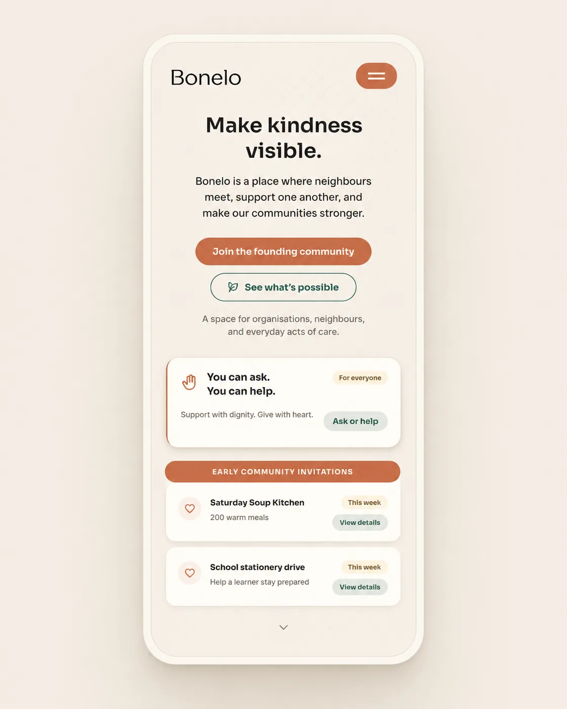
A clear opening promise
The hero introduces Bonelo as a more human kind of digital community and establishes the emotional purpose immediately.
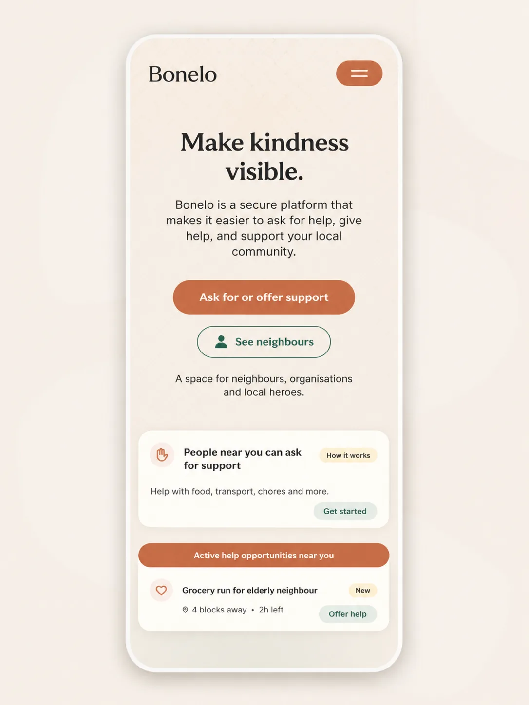
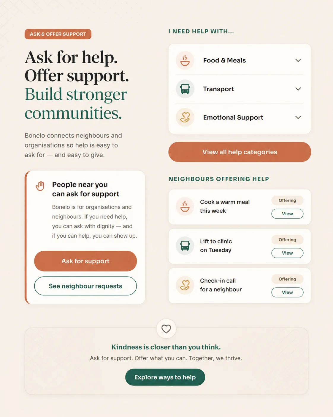
Ask and offer
The central interaction is explained through personal, everyday examples rather than abstract platform language.
How it works
A simple sequence helps visitors understand how needs, offers, connection and recognition fit together.
Founding community
Early visitors are invited to help shape the platform rather than merely join a waiting list.
Our contribution
From an early idea to a coherent launch foundation
- Brand strategy
- Naming and positioning
- Visual identity
- Tone of voice
- Product vision
- User journeys
- Website strategy
- Responsive interface design
- Front-end development
- Prototype development
- Launch infrastructure
- Product documentation
The outcome
A launch-ready foundation for the next stage of Bonelo
The project produced a complete early-stage brand and digital foundation that Bonelo can build on as the community and product develop.
Rather than presenting the concept as a vague social-good initiative, the work established a recognisable brand, a clear value proposition, a structured user journey and a working digital presence.
- A complete brand foundation and visual identity
- A responsive, launch-ready landing page
- A founding-community signup journey
- A clearly documented product direction
- An early interactive platform prototype
- A scalable base for future product development
Building something new—or rebuilding something that no longer works?
WeDevelop combines strategy, design, development and practical automation to create digital experiences that are clearer, more useful and easier to grow. Explore our website design, redesign and automation services to see where a project like yours would start.